Branding for a Direct Primary Care clinic
CLIENT STORY: Ratliff INtegrative Family Medicine
Dr. Melissa opened her new integrative medicine practice after years of experience working in traditional healthcare. Close relationships with her patients are incredibly important to her, and she wanted to ensure that came through in her branding.
Section Styles section-border-top
-
Relationships
Community
Creativity
-
Show that patients will feel comfortable, heard, and at home, as if chatting over coffee with a friend
Communicate the balance between traditional & integrative medicine
Feel like a medical practice without being cold & clinical
-
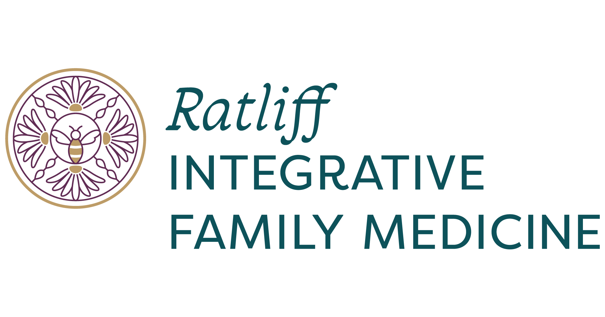
RIFM was personally inspired by the symbol of a bee, which also represents qualities of her business.

We used inspiration from nature to create a logo that communicates everything Dr. Melissa’s healthcare practice is about:
Bee: a personal symbol that also represents relationships, teamwork, helpfulness, and perseverance.
Cone flower: a symbol of health and healing.
Section Styles section-border-top
The result: perfectly-fitting brand identity design for her practice
In the design, the bee is symbolic of relationships, collaboration, helpfulness, and perseverance (both in Dr. Melissa’s own work, and in her patients’ journey to better health). Cone flowers commonly represent health, and tie into natural treatment. The intersecting lines represent connections and relationships.
Section Styles section-border-top
Section Styles section-border-top full-width


Section Styles section-border-top


“I was so impressed by Alyssa’s strategy for design. We talked about values and what is important to me. She really gets to the core of the person and the design just sort of unfolds naturally.”
Section Styles section-border-top


