Visual Branding for a Marketing Agency
CLIENT STORY: One for the Books
One for the Books, a strategic marketing agency, reached out for branding and website design to help communicate the professionalism and experience they bring to client projects. With an 18-year background in the field, owner Catherine wanted their new look to reflect their expertise and endure for many more years.
Section Styles section-border-top
-
Story
Curiosity
Leadership
-
Create a brand that impresses & instills confidence in the services offered
Establish a strong, consistent look
Visually differentiate from your competitors
-
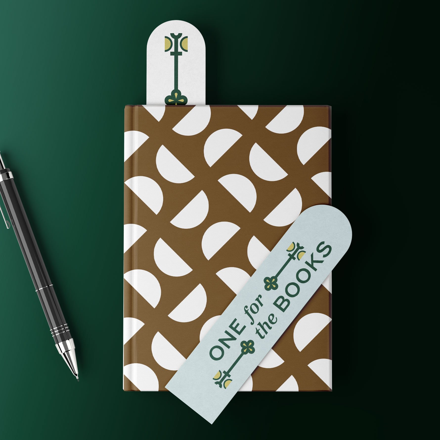
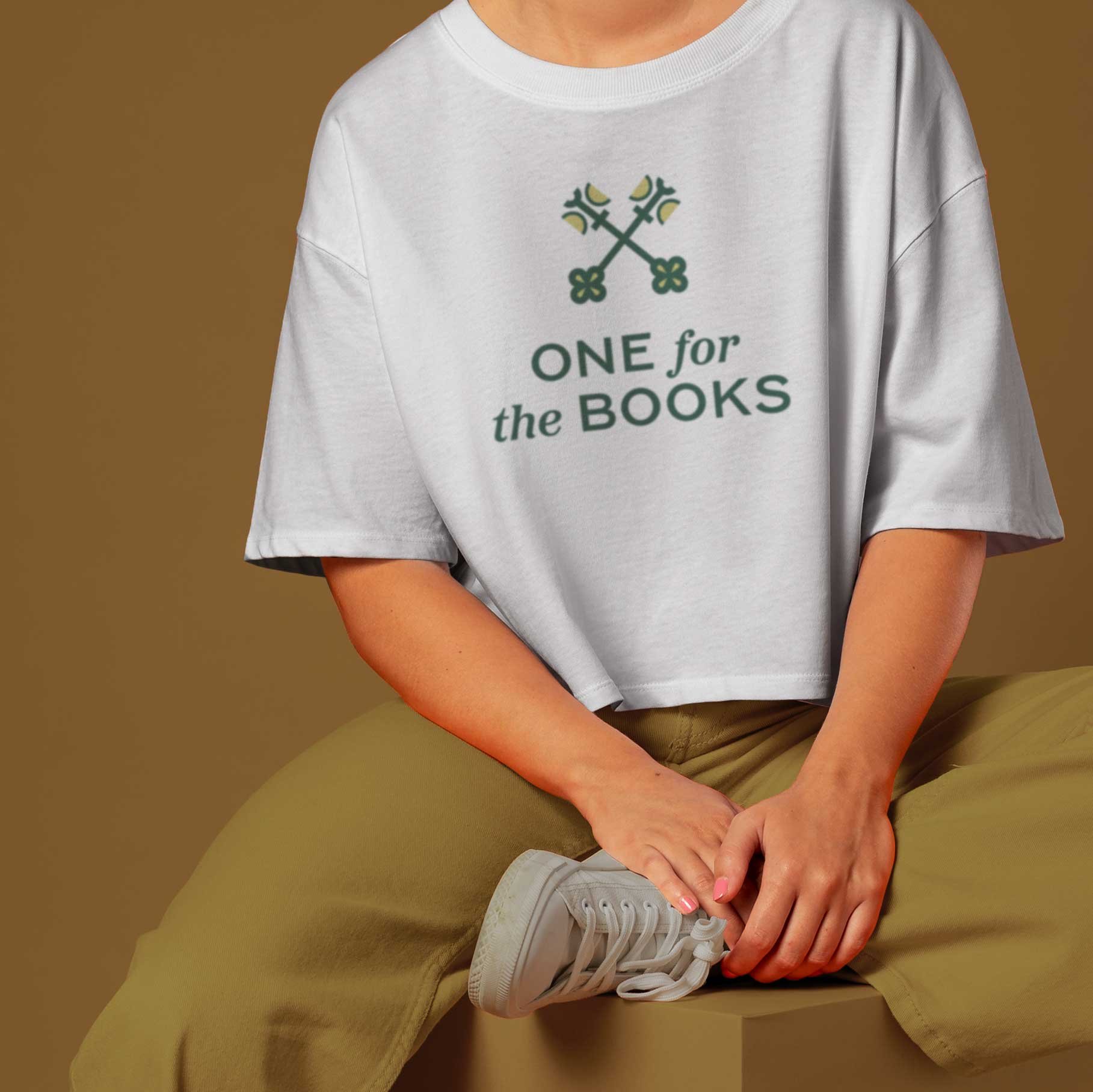
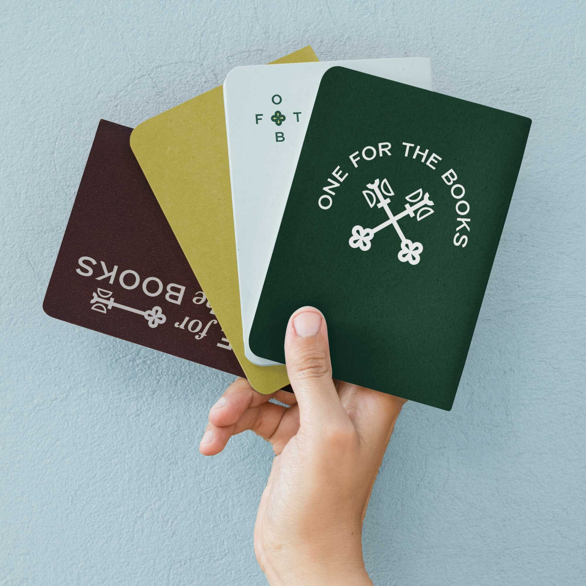
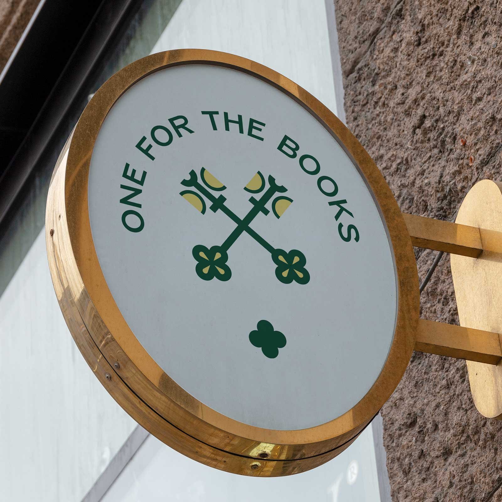
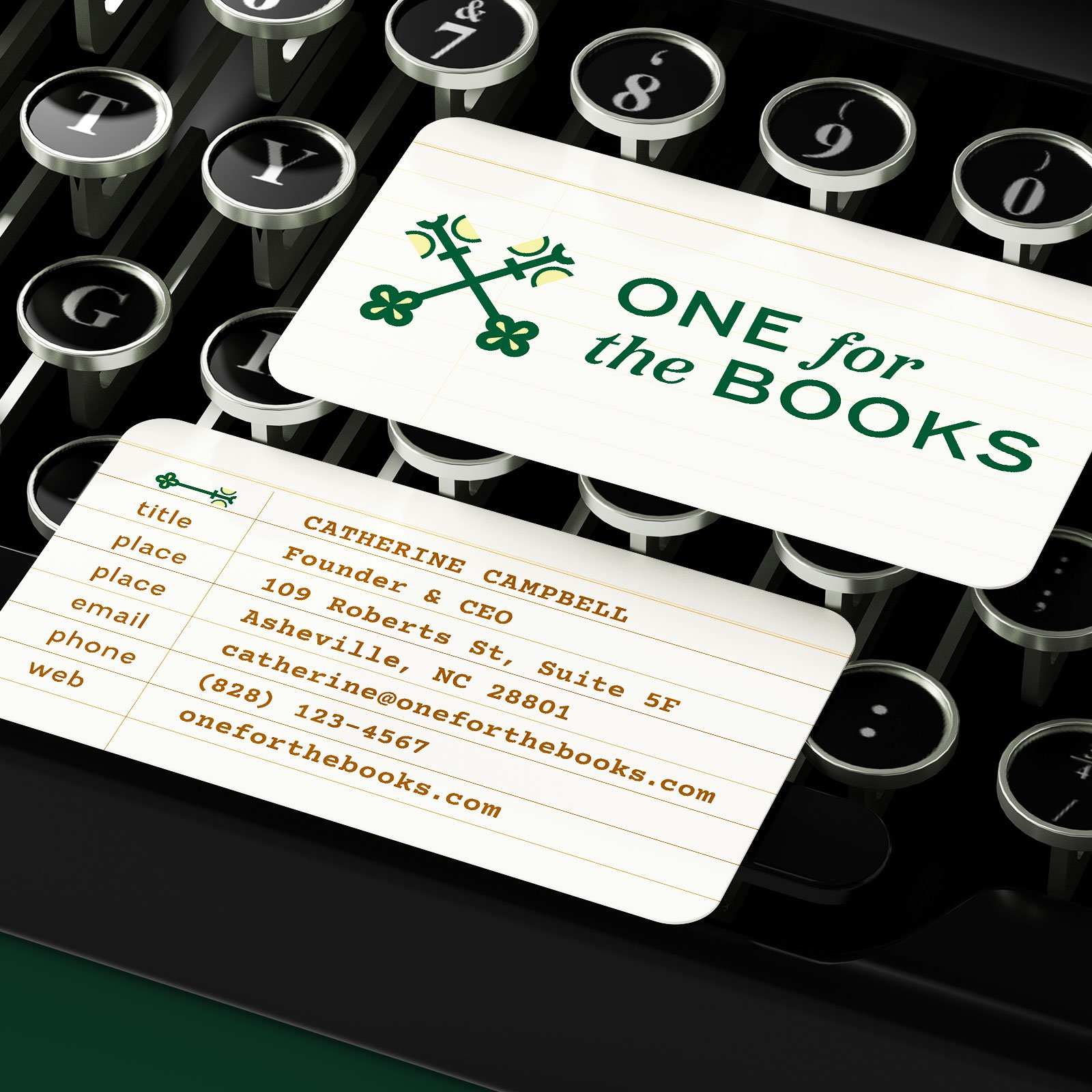
OFTB was inspired by heritage, books, libraries, and archives.
This logo was featured in LogoLounge Book 15
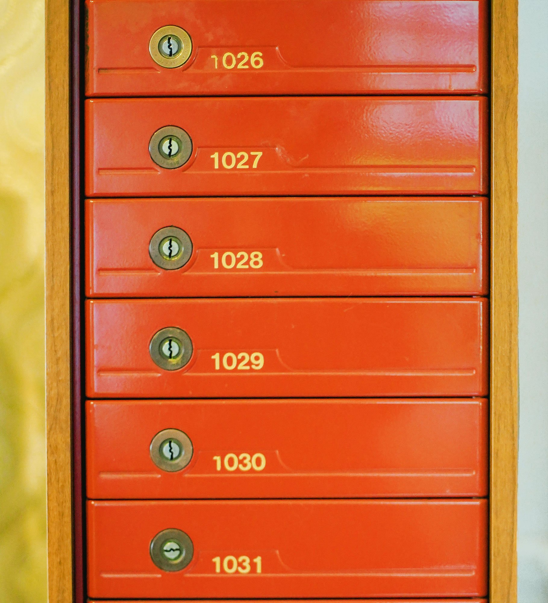
The concept for One for the Books’ logo design is inspired by unlocking stories.
Section Styles section-border-top
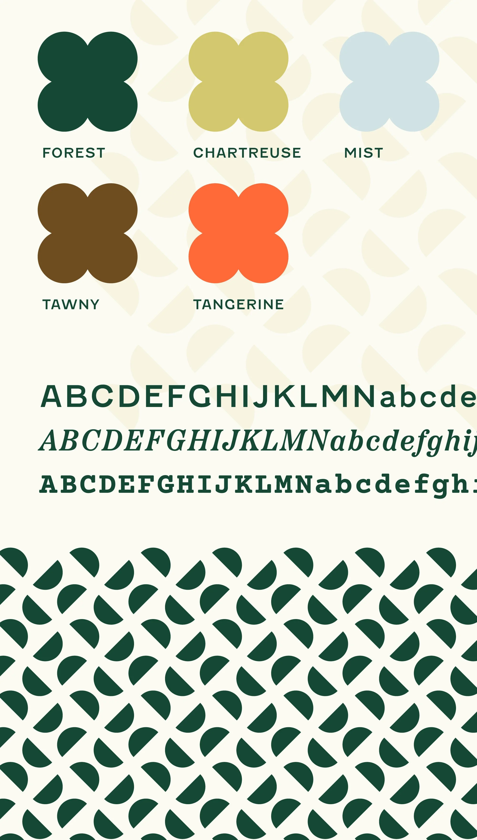
The result: a strong, bright brand identity design that nods to heritage and story.
One for the Books works with heritage brands; companies that have been in business for many years already and have a strong brand story behind them. In their branding, we leaned into the themes of story and history. The keys represent unlocking the history, data, and world of a brand, and unlocking its potential. Crossing the keys represents teamwork, and the intersection of a brand with its audience. The modern-retro design is rooted in history and heritage while feeling both fresh and traditional.
After completing OFTB’s branding, we also collaborated on their website.
Section Styles section-border-top
Section Styles section-border-top full-width
Section Styles section-border-top


“[Before working with you,] I needed to grow my business from a solo consultancy to a marketing agency, but my current brand didn’t reflect where I wanted to take the company. I was so impressed by your thoughtfulness and deep diving to find story-worthy details to make the brand not only beautiful but meaningful. The same thing happened with the website.
I feel really proud of the brand and the website. A fully custom brand allows us to stand out and attract clients and talent to grow my team. The process was so proactively communicated and handled smoothly, even when we were deterred by a hurricane. [What stood out about you was] the level of communication and resources! I didn’t have to think about it — it felt like every question I could possibly have was anticipated. The thoughtful touches like including versions in our brand decks to reflect our changes, to launch graphics, to freelancer referrals...WOW.”
Section Styles section-border-top
