Logo and Branding for a hot yoga and fitness studio
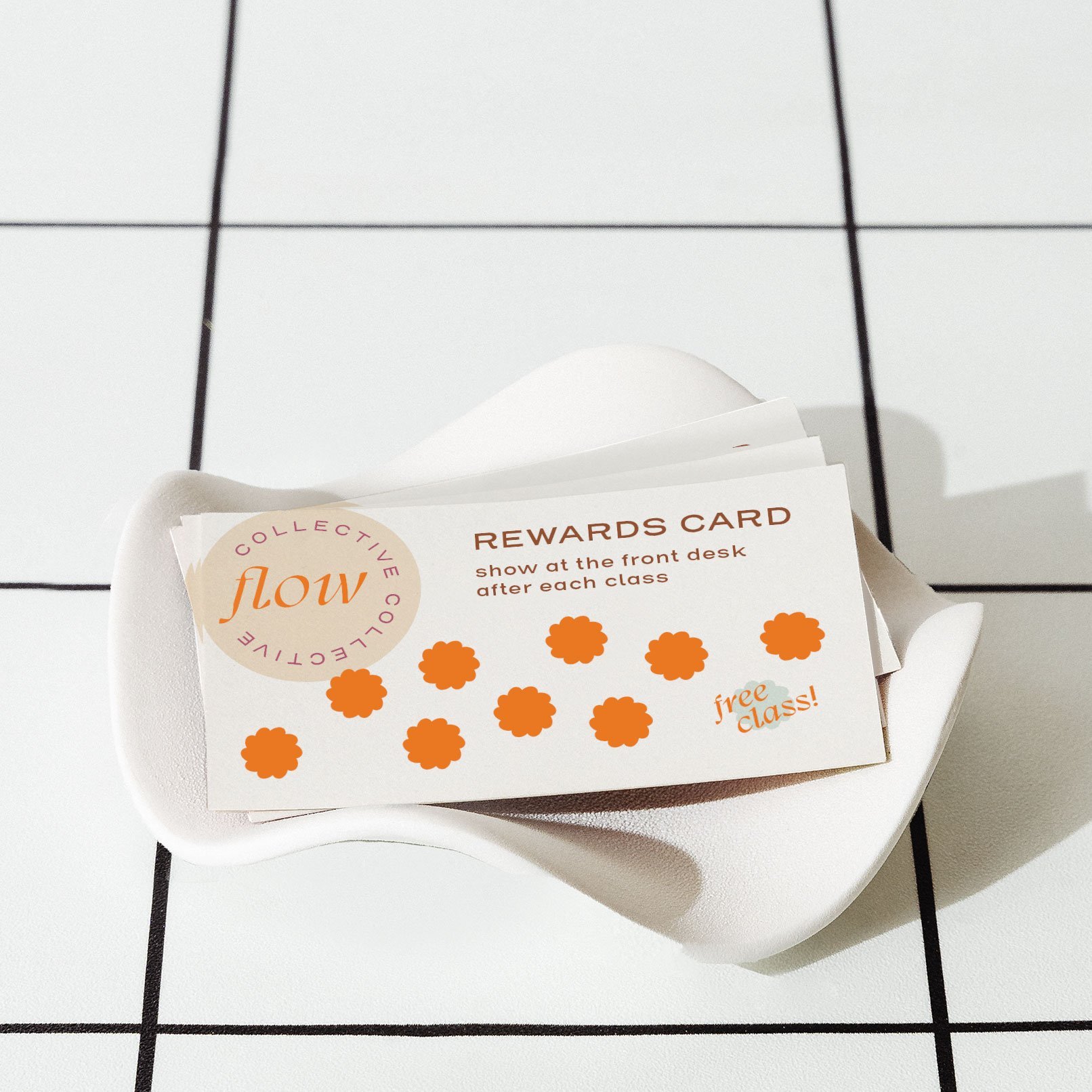
CLIENT STORY: Flow at Foundy
Flow at Foundy reached out when opening their space in Asheville’s River Arts District, a studio that blends hot yoga with working out. Owners Megan and Erin wanted their brand to communicate energy and a modern twist on yoga practice.
Section Styles section-border-top
-
Movement
Positivity
Community
-
Feel polished, professional, legit, and different from other yoga studios
Blend a modern style with a homegrown feel
Create a brand that can grow as their business and goals expand
-
Flow at Foundy wanted to send the message that a class at their studio will “kick your ass and you’ll love it.”
The branding for Flow at Foundy’s fitness-based yoga focuses on breaking a sweat and getting a good workout.
Section Styles section-border-top
The result: a logo that communicates the workout, growth, and energy of their yoga studio
The two “F”s in the logo design feel like limbs stretching into yoga poses, and the shapes are inspired by sweat droplets. The mirrored, back-and-forth motion alludes to community and support. Together, their new branding feels elegant and modern while playful and warm.
Section Styles section-border-top
Section Styles section-border-top full-width


Section Styles section-border-top


Section Styles section-border-top
“You really listened to us and got to know our business, and it was clear you understood what we were trying to get across in our branding and made sure that came through.
[Your] communication was great and expectations were clearly set, which made it easy for us to know what we needed to do and by when. I was impressed with the number of designs we got as part of the deliverable (e.g., different icons, logos, etc.).
We are very happy with the branding! It communicates exactly what we want to get across and make us seem like a legitimate business.
”
Section Styles section-border-top
