Fun, playful branding for a yoga studio
CLIENT STORY: Quirk Yoga
It was a pleasure collaborating with Quirk Yoga, a studio in Augusta, GA, on a new brand. Owner Lindsey’s goal was embrace quirkiness, breaking out of the stereotypical image of perfection often associated with yoga brands, and communicate that anyone can do yoga.
Section Styles section-border-top
-
Energy
Growth
Community
-
Break away from the stereotypical image of yoga perfection
Embrace radical authenticity
Communicate a welcoming and playful look
-
Quirk was inspired by the notion of growth and change through yoga practice.
For Quirk Yoga’s branding, we incorporated symbols of energy, play, and inclusivity.
Section Styles section-border-top

The result: a bold, out-of-the-box logo for a yoga studio that communicates Quirk’s unique qualities
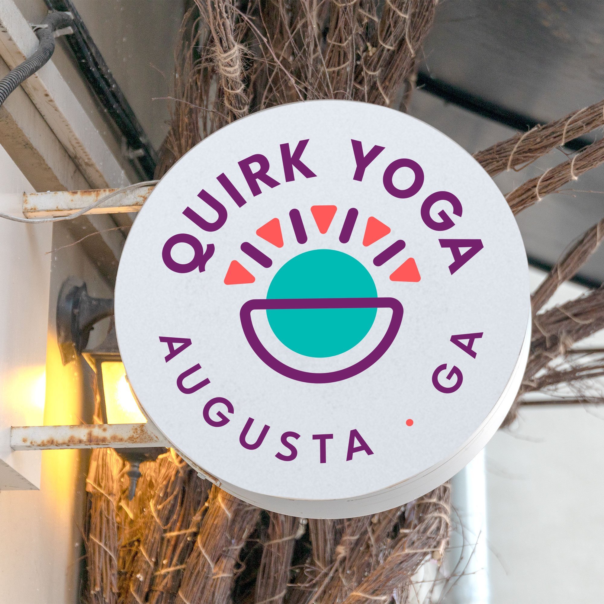
In the logo, the sun-like shape represents energy and playfulness. The combination of shapes symbolizes inclusion, in that yoga is for all different types of people and bodies. The nested circles communicate a sense of support, while the shapes radiating out of the center represent growth and better wellbeing achieved through yoga practice.
Section Styles section-border-top


Section Styles section-border-top


Section Styles section-border-top


