My Packaging Design Background
Something I’ve always wanted to do more of through my business is package design. My branding background prior to launching Amp’d Designs included many tangible pieces.
In fact, my last full time job before going solo was as the Art Director at a high end print company in NYC where I worked closely with our in-house team of specialty printers. Every day was spent designing and formatting custom files for envelopes, boxes, and labels that included custom die lines, laser cutting, die cutting, foil stamping, engraving, embossing, letterpress, you name it!
I’ve talked a lot about the focus I had on branding throughout my college experience at Pratt Institute. I also focused heavily on packaging, and incorporated print design into pretty much all of my key projects.
One of the required classes for my Communications Design degree was Packaging Design. I recall being quite nervous to take the class; I’d taken some sculpture/industrial-design courses and not been a huge fan, and I imagined Packaging would be similar. It also seemed intense, and I was worried I wouldn’t have the skills for it. But boy was I wrong! It actually ended up being one of my favorite courses, and I found so much excitement in bringing my designs to life in 3D.
~~~
Below, I’m sharing a few of my college packaging projects—along with some behind-the-scene process shots! While I have definitely come a long way as a designer since college, 10 years later I can still say I am proud of this work; it certainly gave me a solid understanding of packaging construction, as well as intentional, conceptual design.
M&Ms
This assignment was to reimagine the packaging for M&Ms, as well as a shelf display. My concept was to create a squeezable package with a tear strip. The bottom of the display box was made from one single folded piece of paper. Special thanks to my dorm roommate for being the hand model! (:
This project was featured on a number of design websites, including Packaging of the World, Package Inspiration, PSFK, Design Taxi, and Trendhunter


Your Lost Sock
This assignment was to design a cubed box that could hold 8 smaller cubed boxes inside it. The contents were completely up to us. Most students went for things like tea and candy, but I went the quirky route with an imaginary brand to replace the socks lost in the washing machine. The tagline was, “you’re never going to find it.” This is probably one of my favorite college projects just because it makes me laugh! I had a lot of fun drawing all the cute icons, filigrees, and custom lettered logo.


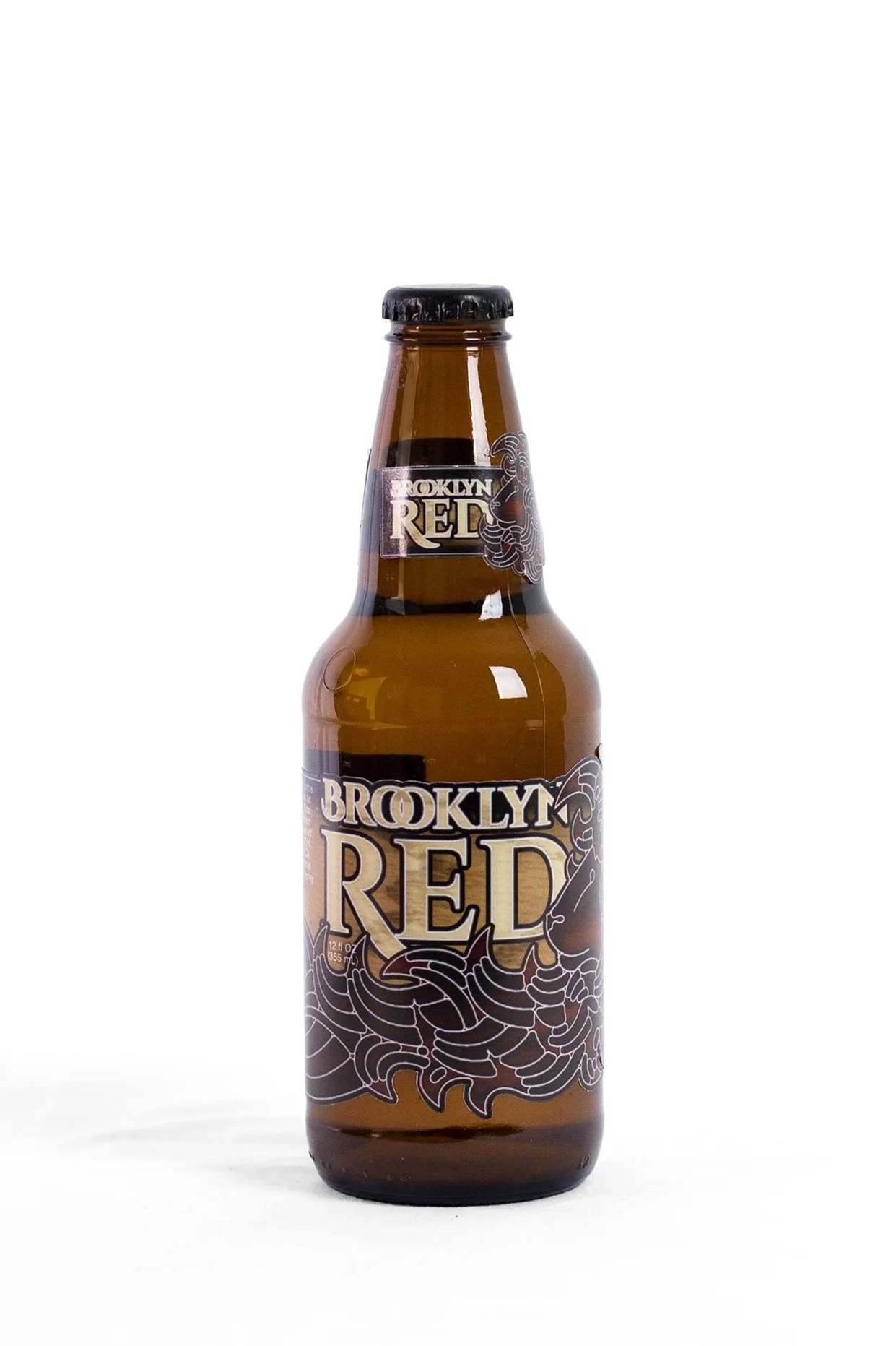
Brooklyn Red
This beer label and packaging was the first assignment in my college Packaging Design class. We were tasked to brand and label a beer called “Brooklyn Red” any way we wanted. Through research I learned that the Dutch were the first to settle in Brooklyn, so my lion was inspired by the Dutch coat of arms.


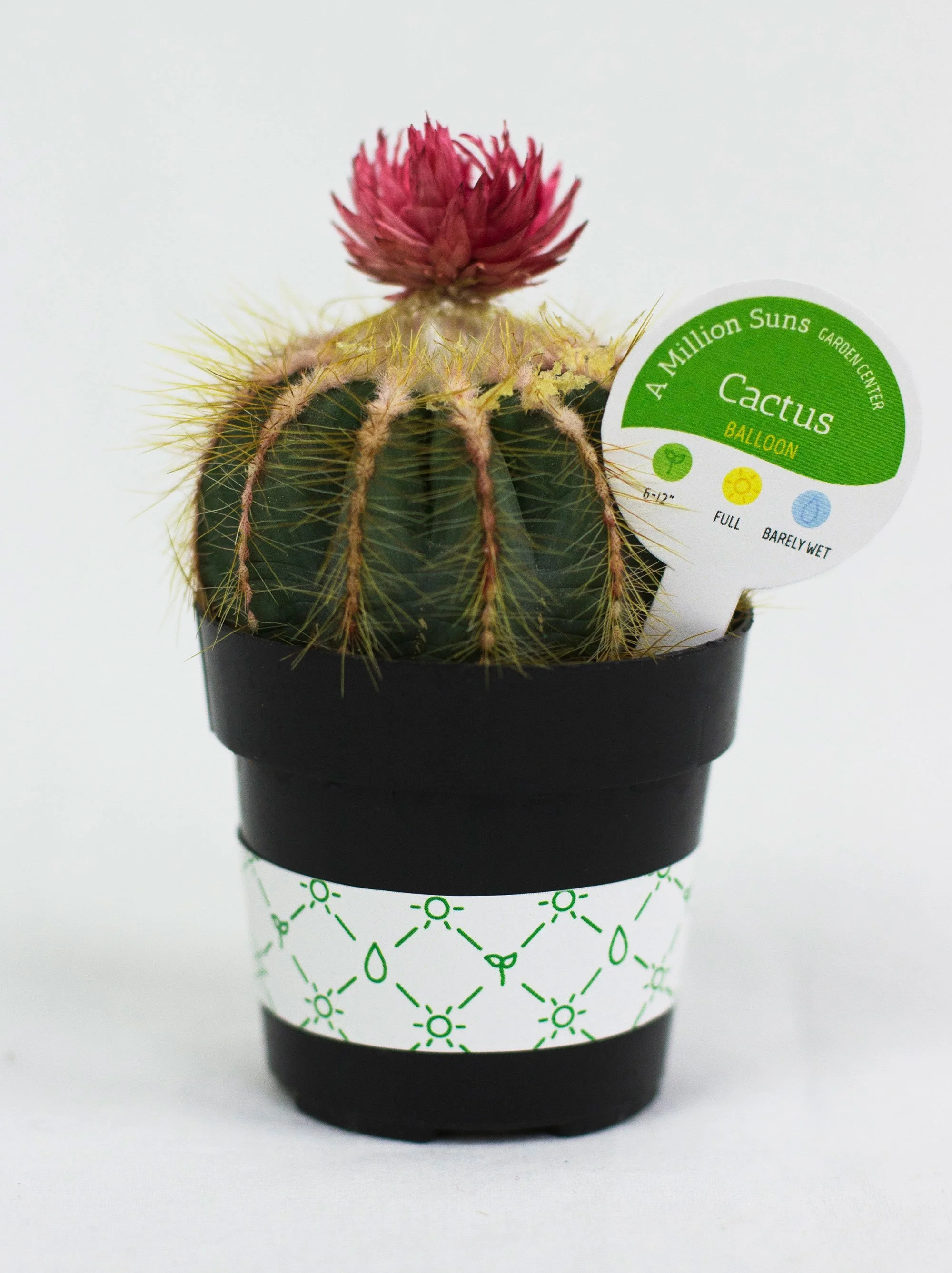
A Million Suns
One of our Graphic Design class assignments was to pick a line from a Beatles song and design a brand around it. I chose the phrase “a million suns” from “Across the Universe” and created a fictitious garden center. For this project I collected a few items from the dollar store to repackage!


Ear Buds
This assignment was to repurpose an item as packaging for something else. I remember as soon as I looked at a cassette tape and saw the two holes, I knew exactly what to do!
This project was featured on a number of design websites, including Packaging of the World, Lovely Package, Package Inspiration, and Trendhunter


Ray Bans
This silly thing was the result of an assignment to create a designer glasses display. I went to Chinatown for this one to get some knock-off Ray Bans!


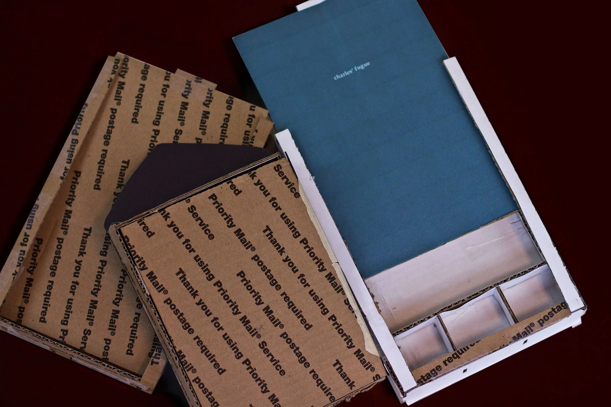
Charles’ Fugue
These pieces were part of one of my 4 senior projects. In a nutshell, this was an original concept and large-scale brand identity design for a restaurant that offered multisensory dining experiences. So it was only fitting that the restaurant menus brought a tactile experience. Through a lot of experimenting, I created these by gluing teal paper to white paper, then using a laser cutter to etch the text in deep enough that it cut all the way through the teal paper, but not the white paper.


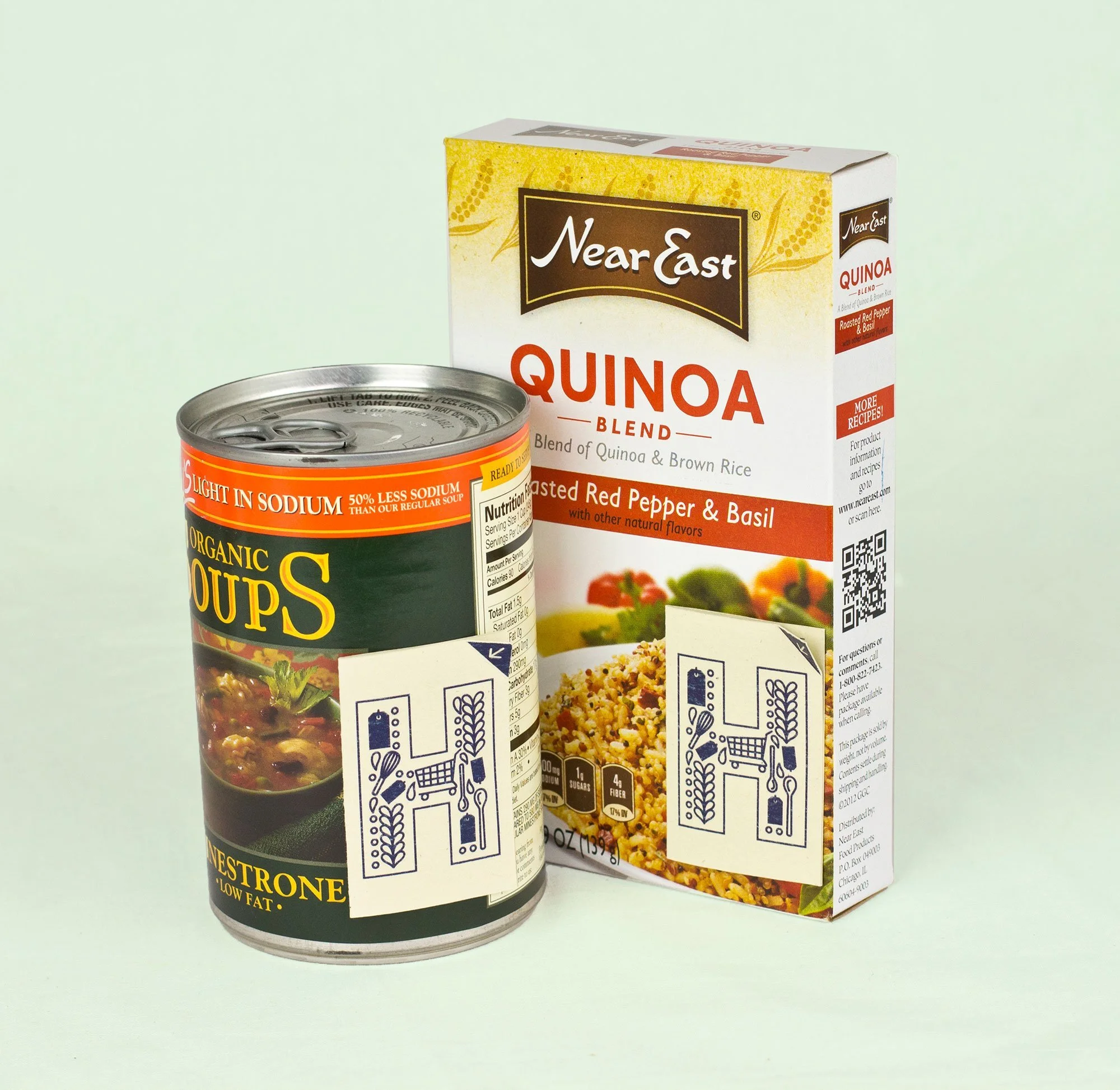
True Harvest
One of my other senior projects was this original concept for an aeroponic growing certification system. This project resulted in a plethora of labels and tags, which I took over to a grocery store and photographed on food packages until an employee finally asked me what I was doing!


Fun fact: I also took all of the photographs for all of these projects during college with a light set I shared with my friends—which is not something I’d want to take on again today! I have serious respect for the skills and attention to detail of professional photographers!

~~~
Even though these college projects are 10 years old and my design skills have very much improved since, I look back on them with a lot of fondness. They taught me a lot about construction, print processes, and paper capabilities. They broadened my knowledge of brand design from just a logo to a tangible brand experience. They influenced me to approach graphic design with deep thought, concept, story, and intention.

So, if you want to have some fun with the physical pieces of your brand, I would LOVE to collaborate. Please don’t hesitate to reach out!
Practical tips from Noah of Timberbrook Marketing to help you send marketing emails that sell — without the slime!