Logo Design Process & Case Study: Pelvic Forward
Part of my personal mission for Amp’d Designs is to humanize the design process and help my clients feel empowered with their visuals.
I love design and collaboration, and I want the process to be fun for everyone I work with. It’s also important to me to express your business’s values through your branding. I wanted to share an inside look at the process I use in the form of a case study for a real client project, Pelvic Forward’s logo and branding.
1. Getting to know you and your business
Every project begins with a questionnaire to review what makes your business unique. The questions begin with specifics about your company and what you do, tapping into your values, goals, and motivations. This helps me to come up with conceptual designs that really convey what your business is about to your customer base.
A few of the questions I often ask are:
“What is the meaning behind your company name?”
“What are some of the things you value most pertaining to your business?”
“If customers only got one message about your business, what would you want it to be?”
To kick off Pelvic Forward’s logo design, I met the owner, Amanda, at Mojo Coworking in Downtown Asheville. I learned that Amanda was focused on three main values for her company: empowerment, embodiment, and education. She wanted to bring the topic of pelvic health to the forefront and help her customers find long-term solutions to problems they’re having, and wanted a logo that expressed energy.
After exploring what your company is about, I also like to hear about your design likes and dislikes. I aim to make suggestions to the aesthetic based on what is appropriate for your brand, but I also want to make sure I don’t design something with a color you actually hate! For example, Amanda wanted a visually bold and striking logo that would really catch people’s attention. Her preference was for black and white, with minimal purple and turquoise color.
2. Research
I always make a descriptive word bank when I begin working on a new logo project.
This part is mostly behind-the-scenes. Before I actually start designing, it’s crucial to do a bit more personal research on your industry and market. I often will read a little more in depth about your services and competitors, and look at logos for similar businesses, as well. It’s important to understand your market so that I can design something appropriate but still help you stand apart from your competitors.
For Pelvic Forward, I read more about the field of pelvic physical therapy, and actually looked at a handful of pelvis bone structures to make sure I understood what I was working with!
As I’m researching, I also always start writing a word bank of adjectives that fit your brand. This helps me personally when developing the mood.
3. Mood board
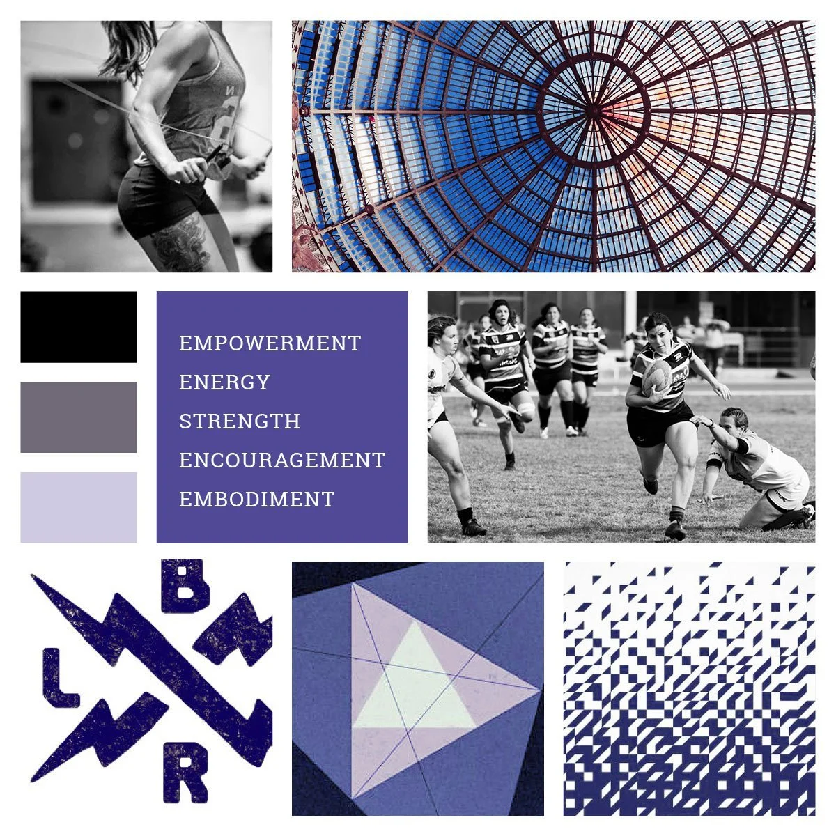
Pelvic Forward’s logo design mood board
Next I share with you a mood board that highlights the general colors I plan to use and a few photos that convey the feeling of your brand. The mood board is not for design, but for a “vibe.” This is helpful for making sure I’ve interpreted our questionnaire meeting properly and am heading in the right direction for the logo design.
Amanda’s mood board for Pelvic Forward contained images of energy and momentum.
4. Sketching
Beginning pencil sketches for the Pelvic Forward logo
I work on the composition and the mark—or the icon that goes along with your company name in your logo—by sketching on paper before moving to the computer. Often I focus on abstract marks that evoke the feelings you described for your business. The goal is to express the purpose of your company through the logo design and evoke a reaction in your customers that goes beyond the surface. In other words, if your business is a bakery, the logo most likely will not simply be a cupcake; the mark should be thoughtful and include an expression of the business’s values (for a bakery, maybe those of quality ingredients or home cooked nostalgia). Not to say that the cupcake shouldn’t be included at all, but going a step beyond the obvious symbolism results in a more unique brand. Having a deeper meaning to your design is what will set your logo apart and provide your design with longevity.
While working on Pelvic Forward, I explored visual representations of her three values (empowerment, embodiment, and education). It was fun to think about the concept, “if you could see empowerment, what would it look like?” Feeling empowered fills you with energy, and I ran with this notion in the sketches.
5. Design
This is what my Illustrator artboards usually end up looking like when I’m designing logos!
After I’ve sketched a collection of concepts I’m excited about, I move to Adobe Illustrator to “bring them to life.” This is one of the most fun parts of the process for me—but it isn’t quick! I tweak design, color, and font continuously until the logo concepts look complete and professional. Even though this is the first round, you should still get a good sense of what your finished design will look like, so I flesh out 3 full concepts for your logo.
Each concept shows your primary logo and secondary marks. For example, if your primary logo is very horizontal, it’s important to think about a vertical version for use in more narrow spaces, or a condensed or round version for use in places like social media profiles. The purpose of this branding package is to ensure that you end up with all the versions you need to launch your brand.
6. First proof
The exciting part! I love presenting first proofs in person in Asheville (otherwise via video chat), so that I can walk through the concepts and review how your unique values inspired the designs.
To help you envision how each concept will look if you decide to choose it, I show each logo mocked up in various scenarios, such as on a coffee mug or on a billboard. It’s helpful to think about the big picture when you’re choosing the face of your business!
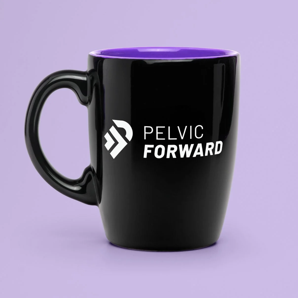
Thinking about the logo being printed on simple office items

Thinking about how the logo elements can expand to a whole brand through pieces like a pattern design

Thinking big! How might the logo look large-scale?
During our dialog we can discuss which elements are working best and what needs to be revised to finalize your logo.
For Pelvic Forward, the chosen option built on the definition of “forward,” with a mark that combined the letter “P” with two forward-facing arrows. It delivers a feeling of driving momentum, and the mark is made of 3 pieces symbolizing the 3 values of empowerment, embodiment, and education.
Chosen option from the first proof
One of the unused options presented in the first proof
7. Revisions
This collaborative phase is so great because we can really hone in on a unique logo that fits your brand and ensure that you are happy with how it turns out!
After meeting with Amanda, we elongated the “P” mark a bit to emphasize the feeling of movement even more, and added a subtle gradient to support the forward momentum.
Chosen logo presented in first proof
Final chosen logo after revisions
8. Finalizing
Once your design has your approval, finalizing begins.
Every detail matters. I make sure that all of the design elements are correctly scaled and aligned, and that letters are not too far apart or too close together. When I prepare the files, I include the primary and all secondary logos in color, black & white, and white knockout, formatted for print and web.
All pieces of the logo are purposefully placed. I use certain elements as a measurement guide. Usually this isn’t obvious, but it does make a difference and helps the logo look optically aligned.
9. Delivery

Pelvic Forward’s brand guideline sheet
Your files are organized into clearly labeled folders. If you want to get your logo printed on a shirt, you’ll know exactly which file to grab. If you’re using it on a web banner you’ll know which file you need. I review a file guide with you to make sure you are able to find everything with ease.
Because my goal is to make sure businesses are prepared to launch their new brands smoothly, I also include business card designs and social media profile images & banners in the logo package. Since these are the most common pieces needed for a new business’s brand, including them right off the bat keeps the look of all the elements consistent, and eliminates the hassle of putting them together yourself or having to get them made separately.
Lastly, I always include a brand guideline sheet. This reviews the exact print and web colors for your logo, as well as your brand’s fonts, to help you keep your look consistent across all print and digital media in the future. Whenever possible I use a Google Font for your brand, which means you can download your fonts for free.

Pelvic Forward’s business card design
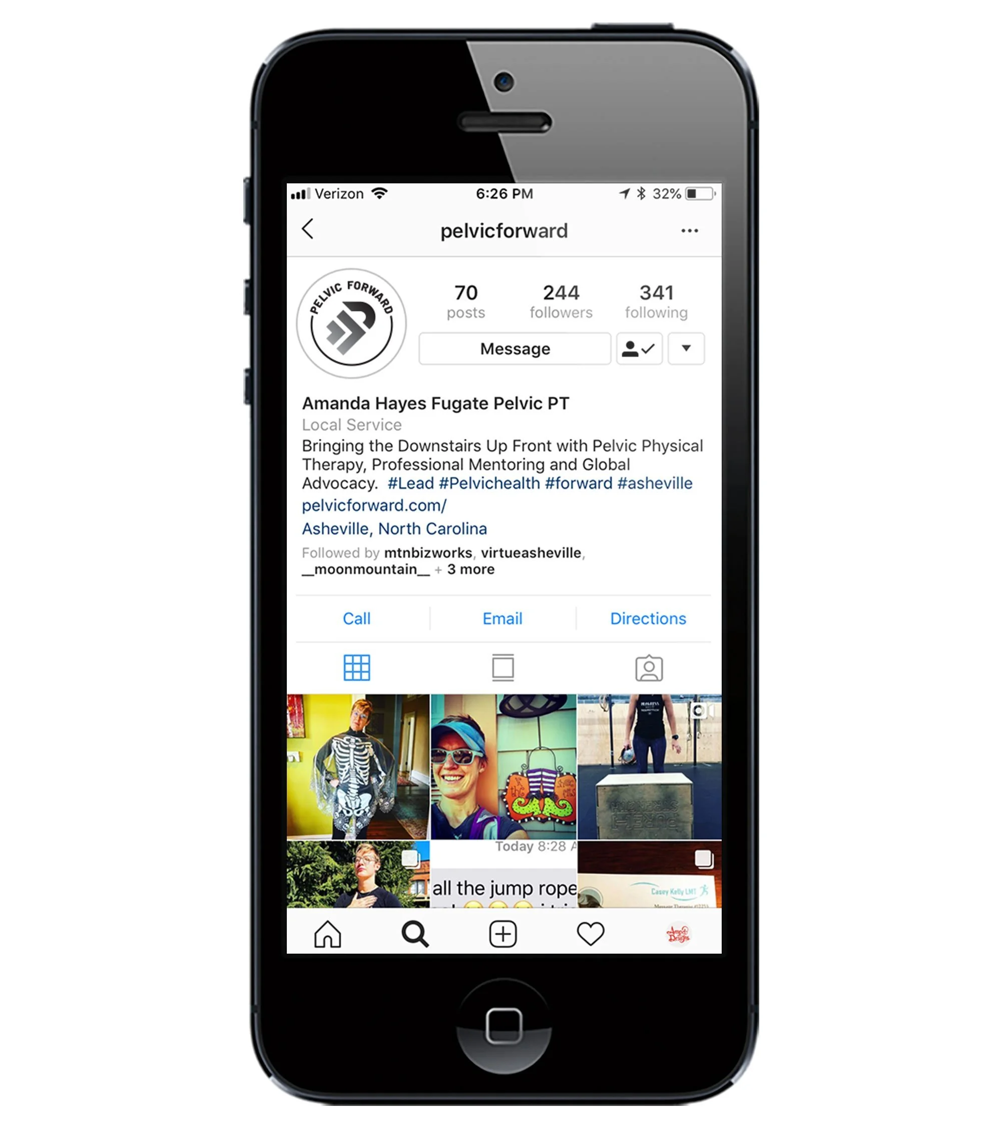
Pelvic Forward’s logo on Instagram
10. Launch!
Now you can present your logo and visual brand to the world! It’s so exciting to be a part of a company’s launch process, and I love keeping in touch and watching businesses grow after this point.
After working on Pelvic Forward’s logo, I also designed her website in Squarespace.
Interested in working together on a branding project?
OTHER RECENT POSTS: